Shopify product pages play a bigger role in conversions than most store owners realise. You can have strong ads and steady traffic, but if your product pages don’t clearly communicate value, build trust, and guide action, sales will stall. This article breaks down why most Shopify product pages aren’t converting — and what needs to change.
A product page has one job: turn interest into confidence, then confidence into action.
If it fails at any step, visitors hesitate, scroll, and leave.
Let’s break down why most Shopify product pages underperform, and what they’re missing.
1. Your Product Page Explains What It Is, Not Why It Matters
Many product pages read like a spec sheet.
Materials. Dimensions. Features. Bullet points.
Useful? Yes.
Persuasive? Not enough.
Shoppers don’t buy features. They buy outcomes. They want to know:
- How does this improve my life?
- What problem does this solve for me?
- Why is this better than the alternatives?
If your product description doesn’t quickly answer “why should I care?”, you’ve already lost attention.
Related read: Why Most Shopify Stores Don’t Convert (And It’s Not Your Ads)
2. Unclear Value Propositions on Shopify Product Pages
When someone lands on your product page, clarity must come first.
However, many pages hide the value behind:
- long paragraphs
- generic headlines
- marketing fluff that says everything and nothing
Visitors should immediately understand:
- who the product is for
- what makes it different
- why it’s worth the price
If they need to scroll to figure that out, friction creeps in.
3. You’re Not Building Enough Trust
Online shopping is built on trust, especially for lesser-known brands.
Yet many product pages lack:
- social proof (reviews, testimonials, UGC)
- clear shipping and returns information
- reassurance around quality and support
Without trust signals, hesitation grows.
And hesitation kills conversions quietly.
Even a great product won’t sell if buyers feel uncertain about delivery, returns, or legitimacy.
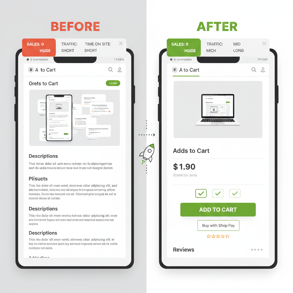
4. Your Mobile Experience Is Working Against You
Most Shopify traffic is mobile.
Many product pages are still designed desktop-first.
Common mobile issues include:
- oversized images pushing key info too far down
- long blocks of text that feel exhausting to read
- add-to-cart buttons that disappear while scrolling
If your product page is frustrating on a phone, users won’t “power through.”
They’ll exit.
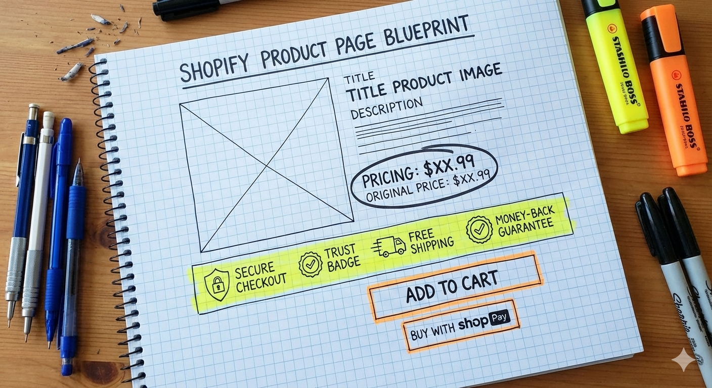
5. Poor CTA Timing on Shopify Product Pages
Timing matters.
Some product pages push “Add to Cart” before trust and value are established.
Others bury the CTA after endless content.
A strong product page guides users:
- first with clarity
- then with reassurance
- finally with a confident, visible call to action
Conversion is a sequence, not a single button.
The Real Fix: Treat Product Pages as Sales Pages
Your product page isn’t a catalog entry.
It’s a salesperson that works 24/7.
When it explains clearly, builds trust, and removes friction, ads suddenly “work better” — without changing the ads.
That’s not magic.
That’s fundamentals.
Need a Shopify developer or specialist to audit and improve your product pages? Reach out and let’s see how we can improve your store.